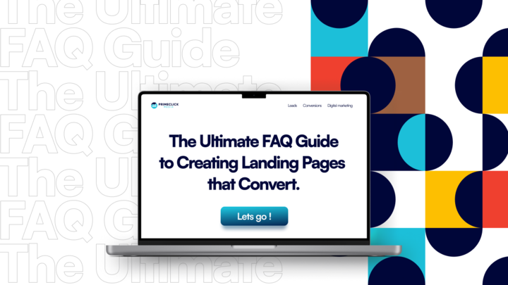
In the digital landscape, where attention spans are fleeting and competition is fierce, the ability to create landing pages that truly convert has become a game-changer for businesses. Whether you’re aiming to generate leads, boost sales, or drive engagement, a well-crafted landing page can be the catalyst that propels your business towards success. In this ultimate FAQ guide, we will unravel the secrets behind creating landing pages that are not only visually appealing but also highly effective in converting visitors into customers. From crafting compelling headlines to performing A/B tests, we will guide you through each step of the process.
In this blog post, we’ll highlight:
- Why landing pages are important,
- Key elements of a high-converting landing page,
- How to create an effective headline for your landing page,
- How to craft compelling copy for your landing page,
- Tips to design a visually appealing landing page,
- Best practices for optimizing your landing page for conversions,
- How you can conduct A/B tests,
- Common mistakes to avoid when creating landing pages, and
- Common tools and resources for creating landing pages that convert.
Why are Landing Pages Important?
Landing pages play a crucial role in any digital marketing campaign. They are specifically designed to capture the attention of visitors and guide them towards a desired action, such as making a purchase, signing up for a newsletter, or filling out a form. Unlike your website’s homepage or other pages, landing pages are laser-focused on achieving a single objective, making them highly effective in driving conversions.
One of the key reasons landing pages are important is because they provide a targeted and personalized experience for visitors. By directing users to a dedicated landing page that aligns with their specific needs or interests, you can increase the chances of conversion. When visitors land on a page that speaks directly to their pain points and offers a solution, they are more likely to take the desired action.
Key Elements of a High-converting Landing Page
Creating a high-converting landing page requires careful consideration of several key elements. These elements work together to create a seamless user experience and encourage visitors to take action. Let’s explore each element in detail:
- Compelling Headline: The headline is the first thing visitors see when they land on your page. It should be clear, concise, and attention-grabbing. A compelling headline immediately communicates the value proposition and entices visitors to continue reading.
- Engaging Copy: The copy on your landing page should be persuasive and highlight the benefits of your product or service. Use a conversational tone, address pain points, and clearly articulate how your solution can solve the visitor’s problem.
- Call-to-action (CTA): A strong and well-placed CTA is essential for driving conversions. Use action-oriented language, such as “Sign up now” or “Get started today,” and make sure the CTA stands out visually.
- Visuals: Use high-quality images and videos that are relevant to your offering. Visuals can help reinforce your message, evoke emotions, and make your landing page more memorable.
- Social Proof: Incorporate testimonials, case studies, or reviews to build trust and credibility. Social proof helps alleviate any doubts or concerns visitors may have and increases their confidence in taking the desired action.
- Form or opt-in: If your landing page requires visitors to provide their information, keep the form simple and straightforward. Only ask for essential details and make the submission process quick and hassle-free.
How to Create an Effective Headline for Your Landing Page
The headline is arguably the most important element of your landing page. It’s the first thing visitors see, and it plays a crucial role in capturing their attention and convincing them to stay on the page. Here are some tips for creating an effective headline:
- Be Clear and Concise: Your headline should clearly communicate the value proposition and the benefits visitors will receive by taking the desired action. Keep it concise and avoid jargon or complex language.
- Create Urgency: Use words or phrases that create a sense of urgency or scarcity. This can motivate visitors to take immediate action rather than putting it off for later.
- Address Pain Points: Identify the pain points your target audience is facing and address them directly in your headline. Show that you understand their challenges and offer a solution.
- Use Numbers or Statistics: Incorporate numbers or statistics to make your headline more specific and tangible. For example, “Increase your conversion rates by 50%” is more compelling than just saying “Increase your conversion rates.”
- Test and Optimize: Don’t settle for the first headline you come up with. A/B test different variations to see which one performs the best. Continuously optimize your headline based on data and visitor feedback.
Note: Your headline should grab attention, convey the unique selling proposition of your offer, and create a desire to learn more. Take the time to craft a compelling headline, as it can significantly impact the success of your landing page.
How to Craft Compelling Copy for Your Landing Page
In addition to a captivating headline, the copy on your landing page plays a crucial role in persuading visitors to take action. Here are some tips for crafting compelling copy:
- Know your Target Audience: Understand the needs, desires, and pain points of your target audience. Tailor your copy to address their specific challenges and show how your product or service can solve their problems.
- Focus on Benefits: Instead of just listing features, highlight the benefits your solution offers. Explain how it can improve the lives or businesses of your target audience. Use storytelling techniques to make your copy more relatable and engaging.
- Use clear and Concise Language: Keep your copy simple and easy to understand. Avoid using jargon or technical terms that could confuse or alienate your audience. Use short paragraphs and bullet points to improve readability.
- Include Social Proof: Incorporate testimonials, case studies, or reviews to build trust and credibility. Testimonials from satisfied customers can help alleviate any doubts or concerns visitors may have.
- Create a Sense of Urgency: Encourage visitors to take immediate action by creating a sense of urgency. Use phrases like “Limited time offer” or “Only X spots left” to motivate them to act now rather than later.
- Optimize for SEO: While it’s important to write compelling copy for humans, don’t forget to optimize your landing page for search engines. Conduct keyword research and incorporate relevant keywords naturally into your copy.
Designing a Visually Appealing Landing Page
The visual design of your landing page plays a crucial role in capturing the attention of visitors and creating a positive user experience. Here are some tips for designing a visually appealing landing page:
- Keep it clean and clutter-free: A cluttered landing page can be overwhelming and distract visitors from the main message. Keep the design clean and minimalistic, with plenty of white space to improve readability.
- Use a consistent colour scheme: Choose a colour scheme that aligns with your branding and conveys the right emotions. Use contrasting colours for important elements, such as headlines or CTAs, to make them stand out.
- Optimize for mobile: With the increasing use of mobile devices, it’s essential to design your landing page with mobile users in mind. Ensure that your page is responsive and displays properly on different screen sizes.
- Utilize visual hierarchy: Use visual hierarchy to guide visitors’ attention and highlight the most important elements. Make sure your headline, CTA, and key benefits are prominent and easy to find.
- Use high-quality images and videos: Visuals can help reinforce your message and make your landing page more engaging. Use high-quality images and videos that are relevant to your offering. Avoid using stock photos that look generic or staged.
- Optimize loading speed: A slow-loading landing page can significantly impact the user experience and conversion rates. Optimize your page’s loading speed by compressing images, minimizing code, and using a reliable hosting provider.
Remember, the design of your landing page should be visually appealing, easy to navigate, and optimized for different devices. By following these tips, you can create a landing page that not only looks great but also drives conversions.
Best Practices for Optimizing Your Landing Page for Conversions
Optimizing your landing page for conversions is an ongoing process that requires continuous testing and refinement. Here are some best practices to keep in mind:
- Keep it simple: Avoid cluttering your landing page with unnecessary elements or information. Keep the focus on your main message and the desired action you want visitors to take.
- Place your CTA strategically: Experiment with different placements for your call-to-action (CTA) button or form. Generally, placing it above the fold or at the end of your copy tends to work well. Make sure it stands out visually and is easy to find.
- Create a sense of trust: Incorporate trust signals, such as security badges or customer testimonials, to build trust with your visitors. Make them feel confident that their information is safe and that your product or service is reliable.
- Use scarcity and social proof: Create a sense of urgency by highlighting limited-time offers or showcasing the number of people who have already taken the desired action. People tend to follow the crowd, so social proof can be a powerful motivator.
- Optimize your forms: If your landing page includes a form, make sure it’s user-friendly and requires minimal effort. Only ask for essential information, and consider using smart form fields that auto-fill based on previous inputs.
- Leverage exit-intent popups: Use exit-intent popups to capture the attention of visitors who are about to leave your page. Offer them a special discount or bonus to entice them to stay and complete the desired action.
Remember, optimization is an ongoing process. Continuously test different elements, analyze the data, and make data-driven decisions to improve your conversion rates.
A/B Testing and Optimizing Your Landing Page
A/B testing is a powerful technique that allows you to compare two versions of your landing page to determine which one performs better. Here’s how you can conduct A/B tests and optimize your landing page:
- Identify the element to test: Start by identifying the specific element you want to test. It could be your headline, CTA button, form layout, or any other element that you believe can have an impact on conversions.
- Create two versions: Create two versions of your landing page, with only one element different between them. For example, if you’re testing headlines, keep everything else the same and change only the headline.
- Split your traffic: Divide your traffic equally between the two versions of your landing page. This can be done using A/B testing software or tools.
- Collect data: Allow the test to run for a sufficient amount of time to collect statistically significant data. This will ensure that your results are reliable and not influenced by random fluctuations.
- Analyze the results: Compare the conversion rates of the two versions and determine which one performs better. Look for statistically significant differences to ensure the results are meaningful.
- Implement the winning version: Once you have identified the winning version, implement the changes on your live landing page. Monitor the performance and continue testing and optimizing other elements to further improve conversions.
Remember, A/B testing is an iterative process. Test one element at a time, collect data, analyze the results, and implement the winning version. Over time, these small optimizations can lead to significant improvements in your conversion rates.
Related Article: The Benefits of A/B Testing Your Ads and Landing Page
Common Mistakes to Avoid When Creating Landing Pages
While creating landing pages, it’s essential to avoid common mistakes that can hinder their effectiveness. Here are some mistakes to watch out for:
- Lack of a clear value proposition: Your landing page should clearly communicate the unique value proposition of your offer. Avoid vague or generic statements and focus on the specific benefits visitors will receive.
- Poor visual design: A visually unappealing landing page can be a major turn-off for visitors. Invest in high-quality visuals, a clean layout, and a consistent colour scheme that aligns with your branding.
- Too many distractions: Avoid including unnecessary elements or information that can distract visitors from the main message or the desired action. Keep the focus on your main objective and remove any elements that don’t contribute to it.
- Lengthy forms: Long and complicated forms can deter visitors from completing the desired action. Keep your forms concise and only ask for essential information. Consider using progressive profiling to gather additional data over time.
- Lack of social proof: Social proof is a powerful tool for building trust and credibility. Incorporate testimonials, case studies, or reviews to show that others have had a positive experience with your product or service.
- Not optimizing for mobile: With the increasing use of mobile devices, it’s crucial to ensure that your landing page is optimized for mobile users. Test your page on different devices and screen sizes to ensure a seamless user experience.
Continue Reading: Common Landing Page Mistakes and How to Fix Them
Tools and Resources for Creating Landing Pages That Convert
Creating landing pages can be made easier and more efficient with the help of various tools and resources. Here are some popular ones:
- Landing page builders: Tools like Unbounce, Leadpages, or Instapage provide drag-and-drop functionality, pre-designed templates, and A/B testing capabilities to simplify the process of creating landing pages.
- Analytics tools: Tools like Google Analytics, Hotjar, or Crazy Egg help you track and analyze visitor behaviour, conversion rates, and other important metrics. This data can be used to optimize your landing pages further.
- Graphic design tools: Tools like Canva or Adobe Photoshop allow you to create visually stunning images and graphics for your landing pages, even if you don’t have a background in design.
- SEO and Copywriting tools: Tools like SEMrush and Ubersuggest can be used to check the top keywords your competitors’ landing pages are ranking for. ChatGPT and other AI assistants can be used to create content outlines and headers. Grammarly can be used to proofread and check for grammar errors. There are many more tools to explore out there.
Note: Although these tools are readily available and can be accessed without putting a strain on your marketing budget, it is important to note that they cannot completely replace your current team (if you have one). If you’re just starting out, it’s recommended that you hire at least one web developer, graphic designer, SEO copywriter, and other experienced personnel to create a landing page that generates tangible outcomes for your business.
Create Landing Pages That Convert!
In this comprehensive FAQ guide, we have emphasized the significance of landing pages in boosting conversions and offered valuable insights on how to craft impactful ones. As a forward-thinking digital ad agency, we recognize the crucial role that a visually appealing landing page plays in enhancing your business prospects.
Don’t let poorly performing landing pages hinder your marketing and advertising efforts further. Let’s revamp your online visibility, elevate your conversion rates, and create compelling landing pages that deliver desired outcomes. Contact us now!
P.S. Remember, every click and conversion matters!

